
Air New Zealand Loyalty SaaS:
A UX and System Design Framework for Future-State Loyalty Journeys to Enhance Engagement
Note: To comply with my non-disclosure agreement with Air New Zealand, I have removed confidential information from this case study.
As a result, I can only share certain activities at a high level.
The case study is written in the present tense to provide an immersive, real-time experience of the story.

Overview
Air New Zealand’s loyalty platform helps frequent flyers track and use their rewards. But users were struggling with confusing layouts, unclear tracking, and not knowing what they needed to do to earn or redeem points. This caused frustration, more support calls, and low engagement.
My goal? To redesign the platform into a simple, smooth experience that makes it easy—and even motivating—for customers to earn and use their points.
OKRs
Squad Objective:
To have a compelling and validated future state loyalty customer experience for High Value Customers (HVC).
OKRs:
KR1 - Establish future state of new loyalty SaaS for HVC with key business stakeholders.
KR2 - Complete and validate appeal with loyalty customer on tier visibility and qualification
Metrics:
NPS & CSAT
Team
Squad:
HVC (High Value Customer) squad of Loyalty tribe.
Way of Working:
Agile Scrum Software Development Team
Members:
1 x Product owner
1 x UX strategist and designer (me)
1 x Business analyst
3 x Software developer
1 x Branding and marketing
1 x Loyalty points specialist
Duration:
20 sprints

The Context
Air New Zealand's loyalty platform is a cornerstone of its customer experience, empowering frequent flyers to track, manage, and redeem their Airpoints rewards. However, the Airpoints loyalty platform—designed over 15 years ago—had become outdated, riddled with usability issues that left users frustrated, overwhelmed, and disengaged.
Complex navigation, unclear status tracking, and fragmented information resulted in a spike in customer support requests and missed opportunities for deeper loyalty engagement.
This case study delves into how I led the redesign of the loyalty platform, adopting a mobile-first approach and a user-centered design methodology to create a seamless, intuitive, and engaging experience for loyalty members across all tiers (Base, Silver, Gold, Elite).

The 15-year-old loyalty portal that requires redesigning.
Applying Agile Scrum project delivery milestones
As part of a major initiative for Air New Zealand to revamp its Loyalty platform, I led the squad from the experience design and research capacity in delivering Agile Scrum project milestones. This high-impact project brought together cross-functional experts from cyber security, sales and marketing, branding, business analysis, development, and solution architecture.
I played a key role (from the experience design chapter) in aligning the team’s efforts by managing the project backlog, refining user stories, and driving sprint planning sessions—all strategically aligned with the organisation’s business OKRs.
This end-to-end project takes 20 sprints to complete.

Loyalty Squad’s project delivery roadmap with quarterly OKRs.
Business problem
The current loyalty platform is falling short of business goals—driving up support centre costs, reducing user engagement, and failing to convert loyal customers into brand advocates. Despite high mobile usage, the platform lacks the performance and clarity needed for effective self-service and loyalty activation.
40% of all loyalty-related customer service enquiries
The most common enquiries to the contact centre stem from users struggling to understand their points balance or tier progress. While Airpoints Dollars are a widely recognised and valuable digital currency in New Zealand’s Air New Zealand loyalty programme, users often lack clarity on how they accumulate and use them.
How Might We redesign the loyalty experience (especially in loyalty progress) to reduce support dependency?
65% use mobile – but engagement drops by 40%
Although 65% of users access the dashboard via mobile devices, engagement levels are 40% lower compared to desktop. This gap signals poor mobile optimisation and a misalignment between user behaviour and design priorities, resulting in lost opportunities for loyalty growth and self-service efficiency.
How Might We redesign a motivating accrual and redemption experience to boost engagement—especially on mobile?
15% Annual Drop in Tier Upgrades Linked to UI Confusion
A lack of clarity in the loyalty platform’s interface is directly impacting performance, with tier upgrade conversions declining by 15% year-over-year. Users are unsure how to track progress or take action, leading to disengagement and lost value for the business.
How Might We redesign a clear tier qualification in the loyalty experience to turn loyal users into active brand ambassadors?
Customer problem
Loyalty members face multiple usability and clarity issues, making it difficult for them to understand or act on their rewards status:
58% dashboard abandonment due to fragmented loyalty view
The loyalty dashboard fails to present a unified view of key information—such as points balance, tier status, and redemption options—causing confusion and disengagement. As a result, 58% of users abandon the dashboard without taking any action, highlighting a major gap in usability and clarity.
How Might We design a more integrated and intuitive loyalty dashboard that encourages user action and improves engagement?
52% of users confused by single progress bar in tier tracking
The loyalty programme requires users to track two types of points—Status Points (earned through flights) and Airpoints Dollars (earned through spending). However, the interface displays only one progress bar, making it difficult for users to understand their status and how close they are to the next tier. 52% of users reported confusion about their tier progress, indicating a critical breakdown in clarity and goal motivation.
How Might We clearly communicate dual point systems and tier progression to help users track their status and feel motivated to engage?
86% click through rate on the contact centre and FAQ options
This suggests that users are struggling to find answers or complete tasks independently within the loyalty platform. When users fall short of the required points to redeem rewards or upgrade tiers, the platform fails to provide clear next steps—such as flying more, spending more, or taking advantage of available promotions. This lack of guidance introduces friction into the user journey, often resulting in abandonment without any further action.
How might we provide clearer, actionable guidance around loyalty points to reduce support dependency and boost user engagement?


Using the 'how might we' approach to address business and customer problem, the journey mapping exercise facilitated a shared understanding of the current experience, highlighting moments of frustration, gaps in the service, and opportunities for innovation.

A comprehensive end-to-end journey was meticulously mapped out during a design sprint in collaboration with key stakeholders.
Opportunity Insights from HMWs
for the Loyalty Platform Transformation
By synthesising and clustering the above HMW questions, I defined four refined problem statements that shaped our project scope and design approach:
1
To shape the desirability of the future state of the end-to-end loyalty journey—ensuring the new Loyalty portal functionality reflects and supports the evolving needs of modern loyalty members.
2
To design a unified, single-view loyalty dashboard—capturing and prioritising the essential tasks that drive action, engagement, and ease of use for loyalty members.
3
To redesign a clear tier qualification model within the earn-and-burn interface—making loyalty accrual and redemption intuitive, easy to understand, and motivating for continued engagement.
4
To test and validate the redesigned tier qualification display with loyalty users—ensuring the final experience is grounded in real user feedback and delivers clarity, usability, and emotional resonance.
Hypothesis:
By designing a unified, single-view loyalty dashboard with an intuitive tier qualification model and future-state portal functionality, we will increase member engagement, ease of use, and motivation, ultimately driving higher loyalty program retention and satisfaction.
Here’s how I led the squad in validating the hypothesis:

The Process
To address these HMW challenges, I followed a structured UX design thinking process, integrating a mobile-first approach and focusing on delivering a seamless experience across all devices. I led the squad in conducting the following activities during the process:
1. Product Discovery and User Research to Shape the Future State of the Loyalty Platform
The foundation of the redesign the loyalty platofrm was built on a deep understanding of user needs and pain points. By leveraging research-driven insights, I ensured the new experience aligned with both user expectations and business objectives.
Methods I Used
Product Discovery Workshops
Collaborated with stakeholders to identify pain points of existing loyalty portal, define the redesign scope, and align on business goals. These sessions established a clear direction for the project.Persona Development
Created detailed personas representing loyalty members across all tiers, capturing their goals, motivations, and frustrations. This helped tailor features and messaging to different user segments.Customer Journey Mapping & Key Episodes
Mapped end-to-end user journeys to uncover friction points in tracking points, redeeming rewards, and tier progression. Identified key customer episodes—critical moments that shaped user experience and engagement—to prioritise impactful improvements.Jobs-to-Be-Done Framework
Defined core user jobs to understand what success looked like for loyalty members. This approach ensured the design focused on solving real user problems rather than just enhancing aesthetics.MoSCoW Prioritisation
Worked with stakeholders to categorise features into Must-Have, Should-Have, Could-Have, and Won’t-Have, ensuring a balanced roadmap that met both user needs and business constraints.User Flows and Touchpoints
Designed intuitive, mobile-first flows for key tasks such as tracking points, managing bookings, and redeeming rewards. The goal was to simplify interactions while maintaining a seamless omnichannel experience.
What I Achieved
Increased user engagement by improving usability and clarity, leading to higher interaction with loyalty programme features.
Boosted redemption rates by simplifying the process of tracking and redeeming rewards, resulting in a measurable increase in point usage.
Reduced customer support queries by enhancing self-service capabilities, leading to fewer issues related to loyalty programme management.
Strengthened stakeholder alignment by ensuring cross-functional teams were aligned on the redesign vision, enabling faster decision-making and a smoother implementation process.


The Process
2. Information Architecture for the Usability of the New Loyalty Portal
The information architecture was restructured to enhance clarity, usability, and engagement of the new loyalty portal. Through card sorting and affinity mapping exercises with stakeholders, I developed a user-centric framework that streamlined navigation and improved accessibility.
Methods I Used
Prioritised Navigation
Simplified the platform by highlighting the most frequently used features—points tracking, benefits, and redemption options—organising them as primary level-one navigation for easy access.Progressive Member Journey in Loyalty Engagement
Designed a structured experience that supports members at different stages of their journey, from onboarding and profile registration to actively participating in accrual and redemption activities.Mobile-Optimised Content Hierarchy
Developed a scannable layout with clear visual hierarchies and concise copy, ensuring seamless readability and interaction across both mobile and web.Single-View Dashboard
Consolidated key loyalty insights into a unified, mobile-friendly dashboard, allowing users to access essential information effortlessly and make informed decisions.
What I Achieved
Improved usability by structuring navigation based on user priorities, reducing cognitive load and increasing ease of use.
Enhanced engagement by designing a progressive journey that guides loyalty members from onboarding to active participation.
Optimised mobile experience through clear content hierarchy and touch-friendly interactions, leading to higher user satisfaction.
Increased efficiency by introducing a single-view dashboard, reducing the time needed to find key loyalty insights.


The Process
3. Conceptual Design and Iteration for the Accrual and Redemption Loyalty Flow
The design phase focused on solving core usability challenges while enhancing user engagement in the ‘earn and burn’ journey for loyalty users. By leveraging user research and iterative testing, I ensured that the new experience was both intuitive and rewarding.
Methods I Used
1. Status Point Visualisation
Conducted user interviews to identify challenges with status tracking.
Explored multiple design concepts, including dual progress bars and circular indicators, to improve clarity.
Implemented a dual progress bar system (one for status points, one for airport points) with colour-coded indicators for instant recognition.
Added visual nudges such as “You’re 2 flights away from Gold status” to encourage engagement and goal-setting.
2. Unhappy Path Mapping & Solutions
Designed clear, actionable messaging for both successful and unsuccessful scenarios.
Introduced real-time recommendations, such as “Earn 200 more points by booking a flight to Sydney,” for users close to an upgrade.
Added tooltips, FAQs, and a chatbot to provide real-time assistance on complex loyalty rules, reducing friction.
3. Mobile-First Enhancements
Designed an adaptive, touch-friendly interface with gesture-based navigation for effortless interactions.
Integrated push notifications to remind users of upcoming benefits or expiring points, driving re-engagement.
Developed a progressive web app (PWA) for faster load times and offline access to key loyalty data.
What I Achieved
Increased clarity and engagement by improving status tracking and providing real-time progress updates.
Boosted upgrade conversions by introducing nudges and tailored recommendations based on user behaviour.
Enhanced mobile accessibility with a touch-friendly design, push notifications, and offline access, leading to higher user retention.
Reduced support queries through proactive assistance features, such as tooltips and chatbots, ensuring users had instant help when needed.


The Process
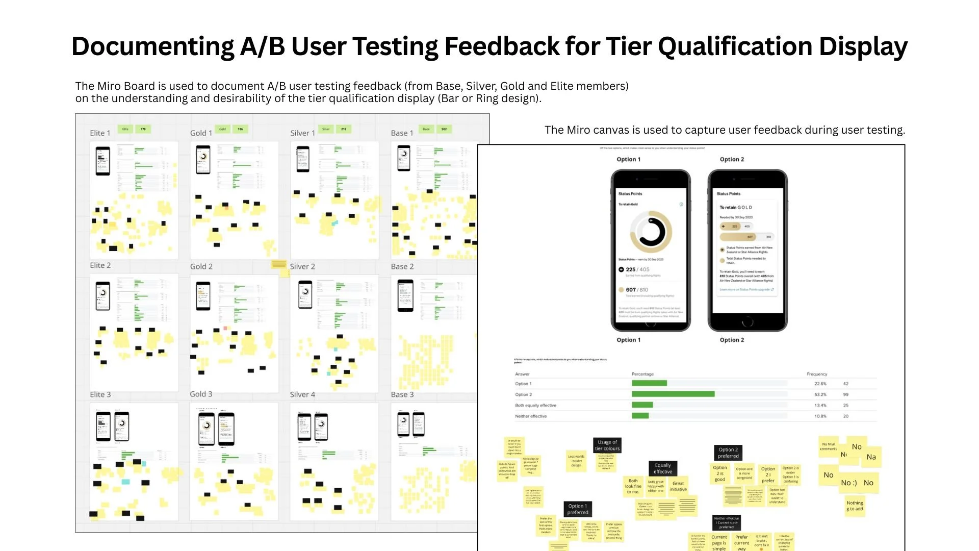
4. A/B Concept Testing and Feedback on the Loyalty Tier Qualification Display
The redesigned platform underwent rigorous testing to ensure it met user needs and expectations. The goal was to validate design decisions and optimise for a seamless experience.
Status Point Visualisation – Hypothesis
Implementing a dual progress bar system with colour-coded indicators for both Status Points and Airpoints Dollars, along with motivational visual nudges (e.g. “You’re 2 flights away from Gold status”), will provide users with clearer insights into their tier progress, leading to increased engagement and a higher rate of tier upgrades.
Methods I Used
1. Usability Testing with High Value Loyalty Customers
Conducted usability tests with frequent travellers across all tiers to assess tier visibility display and users' understanding of tier qualification.
Used A/B testing (bar vs. ring design) to evaluate user preference and comprehension of tier tracking.
2. User Interaction Observations
Observed user interactions with the new dashboard, progress tracking, and redemption flows, ensuring intuitive navigation and seamless completion of tasks.
3. Iterative Design Refinements
Made iterations based on feedback, refining elements such as content clarity, button placement, and micro-interactions to enhance overall usability.
4. Online Usability Tracking
Monitored user interactions and engagement with the tier qualification display (bar vs. ring design) to gauge user preferences and uncover friction points.
5. Behavioural Questions
Asked users to assess the clarity of the design, estimate their earned status points, and describe the design using specific words to gather qualitative insights.
6. Task Completion
Asked users to perform specific tasks (e.g., estimating status points) to evaluate how effectively they could navigate and use the design.
7. Think-Aloud Protocol
Utilised the Think-Aloud Protocol, encouraging users to verbalise their thoughts while interacting with the design to gain insights into their decision-making process and understanding.
8. Preference Testing
Asked users to choose their preferred design (bar or ring) based on their experience, providing insights into desirability and user satisfaction.
What I Achieved
Validated tier visibility and understanding of qualifications, ensuring that users could easily track their progress and comprehend the tier system.
Optimised user flows based on real-time feedback, resulting in smoother interactions and greater satisfaction with the platform.
Refined content clarity and micro-interactions, leading to improved usability and user engagement across the redesigned platform.
Gained valuable user insights, allowing for data-driven design decisions that increased preference for the redesigned interface.
Note: This case study provides a high-level overview of the user testing process. It highlights the importance of user testing in experience design, which I handle with care. I am skilled in conducting in-depth user testing and research (both quantitative and qualitative). For more insights or details, feel free to contact me.

The Process
5. Creating UI Asset to the New Loyalty Design System
To improve consistency and usability, I developed a modular design system for Air New Zealand’s digital loyalty experience, contributing new components to Unison 2.0, the airline’s evolving design system. This ensured a scalable and seamless UI across both native and hybrid platforms, aligning with the airline's broader digital strategy.
Methods I Used
UI Component Creation:
Designed reusable UI components that adhered to Air New Zealand's brand and accessibility standards, ensuring they aligned with the evolving Unison 2.0 guidelines.Asset Development for Unison 2.0:
Created new assets to meet the unique needs of the loyalty SaaS design, ensuring consistency across native and hybrid digital platforms.Visual Refinements:
Refined typography, colour schemes, and iconography to improve clarity, engagement, and overall usability.Mapping Key User Interactions:
Mapped critical user flows to ensure seamless experiences, including:Loyalty dashboards
Upgrade and redemption flows
Tier status and benefit visibility
Native and Hybrid Optimisation:
Designed with a focus on native (iOS/Android) and hybrid web platforms, ensuring optimised user experiences across devices.Collaboration and Integration:
Worked closely with developers and stakeholders to integrate these components into Unison 2.0, streamlining future iterations and ensuring scalability.
What I Achieved
By contributing to Unison 2.0, I helped shape a future-proof design system that supports Air New Zealand’s evolving digital products. This approach ensured a consistent and intuitive experience for frequent flyers, regardless of the platform they used.


The Final Design – Publicly Launched in Q1 2025
The redesigned loyalty platform introduced several key features to enhance usability and engagement:
Mobile-First, Single-View Dashboard
A clean, intuitive layout prioritising key information, such as points balance, tier status, and redemption options.
Clear indication and comprehension of Loyalty Tier Progression
Two distinct rings for status points and airport points, ensuring clarity and transparency.
Visual prompts to encourage upgrades and reward spending.
Enhanced Happy and Unhappy Paths
Smart nudges and real-time recommendations to keep users engaged.
Integrated FAQs and tooltips to simplify complex loyalty rules.
Mobile-Optimised Engagement Features
Push notifications for key updates, such as expiring points or new offers.
Personalised offers and upgrade suggestions based on user activity.
A seamless mobile checkout for redeeming rewards.


The Impact
The redesigned platform delivered measurable improvements in both user experience and business outcomes:
30% Reduction in Customer Service Calls
Users found answers within the platform, reducing reliance on support.
25% Increase in User Engagement
More frequent visits to track points and explore rewards.
15% Higher Redemption Rates
Clearer guidance motivated users
to redeem points before expiry.
+Positive Feedback from Loyalty Members
Users praised the mobile-first design, intuitive dashboard, and transparent tier tracking.
Key Takeaways
This project highlights my ability to:
Conduct in-depth user research and map out both happy and unhappy paths.
Leverage a mobile-first approach to enhance usability and accessibility.
Design clear, engaging UX/UI solutions that drive user behaviour and business success.
Iterate based on user testing and deliver tangible business impact.
By addressing the complexities of Air New Zealand’s loyalty program through a user-centered design approach, I created a platform that not only meets user needs but also drives higher engagement and business success. This case study underscores my commitment to solving real-world UX problems with measurable outcomes, while aligning with business goals and user expectations.